Some Notes on the Paleography of T617 and T24, and Evidence for Their Graphic Convergence
David F. Mora-Marín
davidmm@unc.edu
University of North Carolina
Chapel Hill
2/4/2022 (4 de febrero del 2022)
Resumen: En esta nota se provee evidencia del origen distinto de los grafemas T617 y T24 (Figura 1). Se demuestra que sus formas gráficas fueron distintas durante el preclásico tardío y la mayor parte del clásico temprano, con T617 mostrando forma de óvalo (Figura 2) y T24 forma de gancho (Figura 3). No fue sino hasta finales del clásico temprano cuando T24 empezó a cambiar de forma y a converger gráficamente, poco a poco, con T617, al perder el elemento gráfico en forma de gancho (Figuras 3 y 4). Esto también comprueba que T24, a diferencia de T617, no representa, iconográficamente, un hacha pulida, sino que más bien algún tipo de herramienta en forma de gancho.
There is a general sense among epigraphers that T617/1M3 (Figure 1), the so-called MIRROR or CELT sign that is used in the Initial Sign collocation of the PSS, is formally identical to (i.e. the same sign as) T24/1M4 (Figure 2), the syllabogram li. The two are indeed similar: they are elongated signs, with a partial cartouche, and a double-banded line, usually oriented diagonally, across the middle. It is even likely that T24/1M4 also depicts, iconographically, a polished stone object. Nevertheless, as I show in this note, the two signs were originally graphically and graphemically distinct, and T24/1M4 may have depicted a different type of stone object originally, not a celt-shaped object. That said, I also show here that over the course of the Early Classic period they gradually converged graphically: specifically, T24 became somewhat more like T617.
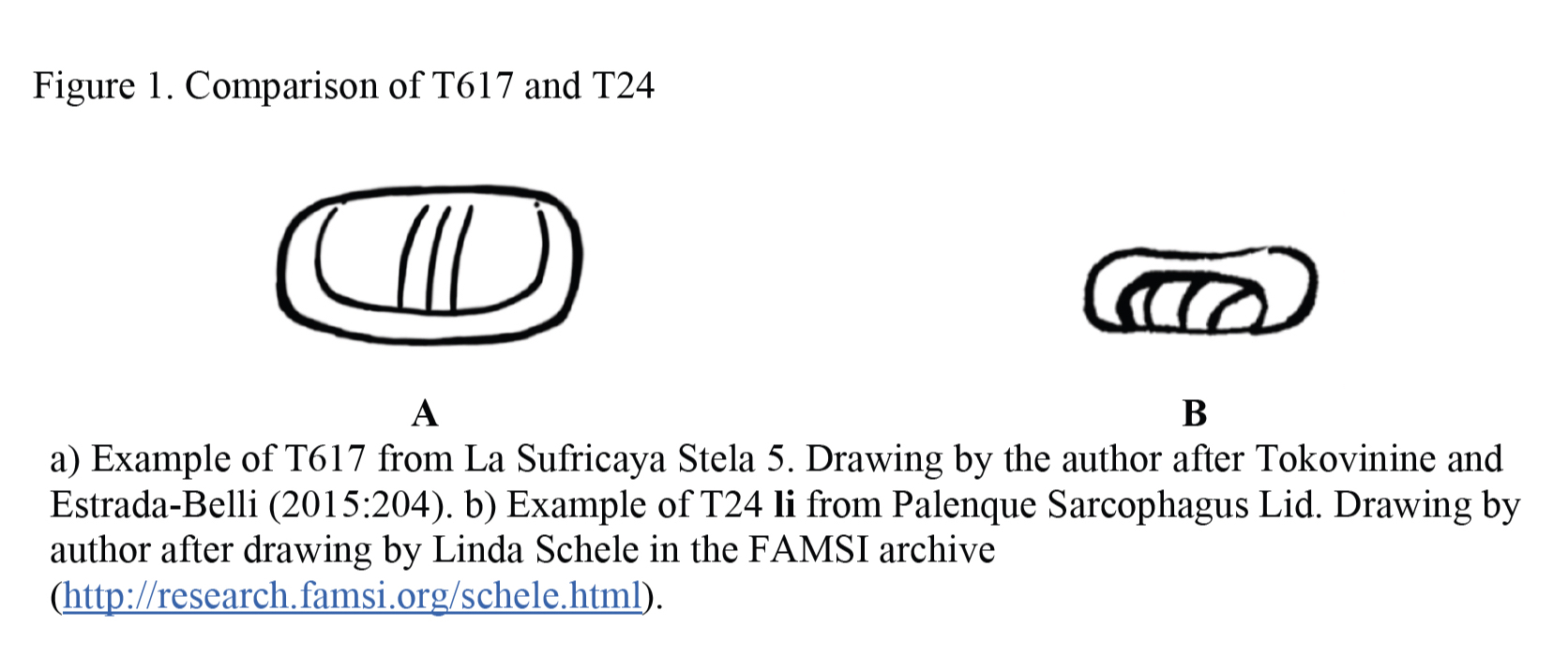
Years ago, Grube (1990:88, 110) suggested that T617 corresponds to the main sign version of T24, and thus, that they constitute the same sign; he even utilized this possible graphic and graphemic correspondence to suggest a Vl value for the T617 grapheme in the context of the Initial Sign Collocation of the Primary Standard Sequence (Grube 1991:224). The fact that Macri and Looper (2003:274–275) refer to the pictorial motivation of both signs as “celt, reflective stone” also is evidence of the equivalence that is often assumed, at least in iconographic terms. As I show next, the early evolution of these signs suggests that there was no graphemic or iconographic equivalence, at least not during the Late Preclassic and most of the Early Classic period.
The earliest examples of T617 are consistent in two traits (Figure 1A, Figure 2): the outline of the sign is always oval in shape, and they show a diagonal band. The diagonal band can be a single band (Figure 2A), a doubled-band that is otherwise plain (Figure 1A), two single parallel bands with horizontal lines across them (Figure 2B), two single parallel bands with cross-hatching (Figure 2C), or two doubled, parallel bands with horizontal lines across them (Figure 2D), among other design variations. But what no example or significant set of examples shows, to my knowledge, is cross-hatching on either side of the diagonal band.
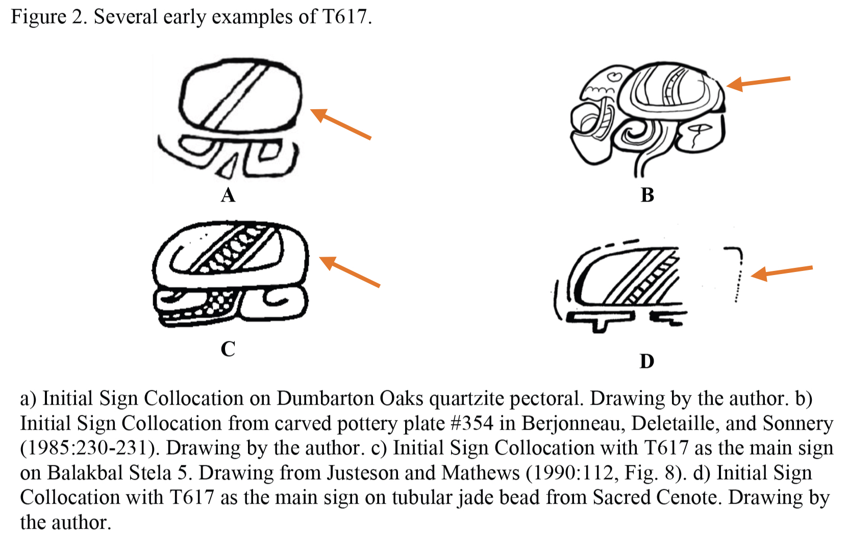
It is time to describe the early designs of T24 li. A very important comparison is provided by the cases of T617 and T24 on the Late Preclassic Dumbarton Oaks quartzite pectoral. The example of T617 (Figure 3A) shows a simple oval outline with a single, plain diagonal band. In contrast, the example of T24 (Figure 3B) on the same text shows a very different, hook-shaped outline; although there is a small internal, rectangular space where a diagonal band may have been intended, it was not visible to me when I examined this artifact in person with magnification. By ca. 120 ce, T24 had developed a diagonal band (or dual diagonal bands), and possibly cross-hatching, as suggested by an instance on the Dumbarton Oaks fragmented jadeite belt plaque (Figure 3C), while retaining the hook-shaped outline. Although many examples exhibit a diagonal band, or a pair of diagonal bands, sometimes with horizontal lines between them, just like different designs of T617 do, this design element is known to occur across many distinct graphemes in Mayan writing, and it is believed to be an iconographic device to indicate that the depicted object is “shinny” as a result of polishing (e.g. Hopkins 1994; Hopkins and Josserand 1999; Mora-Marín 2008). Internal cross-hatching, besides the diagonal band or bands, occurs in some designs of T24 (Figures 3D, 3I, 3J–M), but not others (Figures 3E-F, 3H, 3N with Figure 3G).[1] Eventually, the hook of the hook-shaped outline dissolved (Figures 3L–M), as noted in Mora-Marín (2003:206–207), resulting in a generalized graphic convergence with some designs of T617, especially when the design of T24 lacked cross-hatching (Figure 3N), a design element typically absent from T617, as already noted. Based on this evidence, there is no reason to suspect that T617 and T24 were originally related graphically or graphemically.

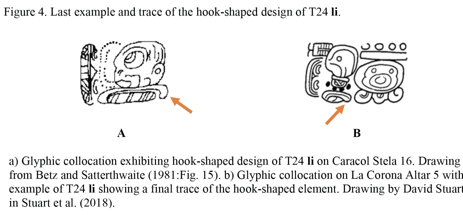
The hook-shaped design of T24 li declined gradually, with the hook-shaped element becoming less and less visible, during the Early Classic period. Its latest-dated occurrence may appear on Caracol Stela 16 (A16) (Figure 4A), dated to 9.5.0.0.0, 535 ce. A few years later most texts exhibit the design lacking the hook element, though a trace of it persists in at least one of the instances of T24 on La Corona Altar 5 (A8) (Figure 4B), dated to 9.5.10.0.0, 544 ce. It is only after this point that T24 begins to resemble T617 more and more. In fact, a design of T24 emerged in which the diagonal band was replaced for an internal loop element that is also seen in some designs of T617. I have yet to investigate whether the internal loop was innovated by T617, and copied into T24, or vice versa. This is a matter left for future research.
To conclude, T617 and T24 started out with very different outlines: an oval outline for the former, and a hook-shaped outline for the latter. The internal components also differed, even though they depicted a generalized iconographic marker of polished surfaces (on various type of stone, turtle shells, and possibly other materials). T24 almost certainly did not originally depict a celt or mirror, but some sort of hook-shaped implement made out of stone or another polishable material. It is only after ca. 9.5.0.0.0 that T24 loses completely its hook-shaped element, and begins to resemble T617 more and more. Given this, there is no reason to suspect any original graphemic connection between these two signs, which otherwise behave very differently, and consequently, there is no reason to implicate the value of T24 li in discussions of the logographic value of T617 in the context of the Initial Sign Collocation (or elsewhere).
[1] Only one case of T617 shows cross-hatching, but within the band element rather than outside of it: the example from Balakbal Stela 5 (Figure 2C). This cross-hatching was perhaps a result of graphic assimilation to the design of T126 ya that is present within the same collocation.
References
Beetz, Carl P., and Linton Satterthwaite. 1981. The Monuments and Inscriptions of Caracol, Belize. Philadelphia: University Museum, University of Pennsylvania.
Berjonneau, Gerald, Emile Deletaille, and Jean-Louis Sonnery. 1985. Rediscovered Masterpieces of Mesoamerica: Mexico-Guatemala-Honduras. Boulogne: Editions Arts.
Grube, Nikolai. 1990. Die Entwicklung der Mayaschift: Grundlagen zur Erforschung des Wandels der Mayaschrift von der Protoklassik bis zur spanischen Eroberung. Ph.D. dissertation, Universität Hamburg.
Grube, Nikolai. 1991. An Investigation of the Primary Standard Sequence on Classic Maya Ceramics. In Sixth Palenque Round Table, 1986, edited by Merle Greene Robertson, pp. 223-232. Norman: University of Oklahoma Press.
Hopkins, Nicholas A. 1994. Days, kings, and other semantic classes marked in Maya hieroglyphic writing. Paper presented at the 93rd Annual Meeting of the American Anthropological Association, Atlanta.
Hopkins, Nicholas A., and J. Kathryn Josserand. 1999. Issues of Glyphic Decipherment. Paper presented at the 17th Annual University Museum Maya Weekend, “Maya Epigraphy— Progress and Prospects”, University of Pennsylvania, Philadelphia.
Houston, Stephen D., John Robertson, and David S. Stuart. 2001. Quality and Quantity in Glyphic Nouns and Adjectives. Research Reports on Ancient Maya Writing 47:1–56.
Justeson, John S., and Peter Mathews. 1990. Evolutionary Trends in Mesoamerican Hieroglyphic Writing. Visible Language 24:88–132.
Macri, Martha J., and Matthew Looper. 2003. The New Catalog of Maya Hieroglyphs. Volume One: The Classic Period Inscriptions. Norman: University of Oklahoma Press.
Mora-Marín, David F. 2003. The Origin of Mayan Syllabograms and Orthographic Conventions. Written Language and Literacy 6(2): 193–237.
Mora-Marín, David F. 2008. Full Phonetic Complementation, Semantic Classifiers, and Semantic Determinatives in Ancient Mayan Hieroglyphic Writing. Ancient Mesoamerica 19:195–213.
Stuart, David, Marcello A. Canuto, Tomás Barrientos, and Alejandro González. 2018. A Preliminary Analysis of Altar 5 from La Corona. The PARI Journal 19(2):1–13.
Tokovinine, Alexandre, and Francisco Estrada-Belli. 2015. La Sufricaya: A Place in Classic Maya Politics. In Classic Maya Polities of the Southern Lowlands: Integration, Interaction, Dissolution, edited by Damien B. Marken and James L. Fitzsimmons, pp. 195–223. Boulder: University Press of Colorado.